
Toward a Kickstarter landing page
minagi is getting its own landing page for Kickstarter. A single goal, a button, and significantly less clutter. Here's what we're cutting and why.
Since July, mi-nagi.com has been live. The site does a lot: a magazine with nine articles, a perspectives page, a datasheet, seven audience segments, a sound installation you can hear in the browser, and since September a chat with Mira powered by our Company Braon. Strong for discoverability and storytelling. But Kickstarter plays by different rules; we're targeting a specific audience. Someone who thinks: I want the minagi. That person is hunting for a simple reserve button, not distractions.
This week we're building our first landing page for the campaign. The design happens in Claude Design, the same way we built the design system for the current site (week 6). Claude delivers the first draft, Geert-Jan and I strip it down, shuffle, and decide. We know this page won't go live yet because we're still tinkering with minagi itself, but we're laying a solid foundation.
One goal, three numbers
The page has a single purpose: a visitor reserves a numbered copy of Edition 01. Two KPIs follow: how many people sign up just for launch notification, and how far down the page visitors scroll before hitting the reserve block.
That metric becomes the lens for every section: does this move one of those three numbers? If not, it's gone.
What gets cut
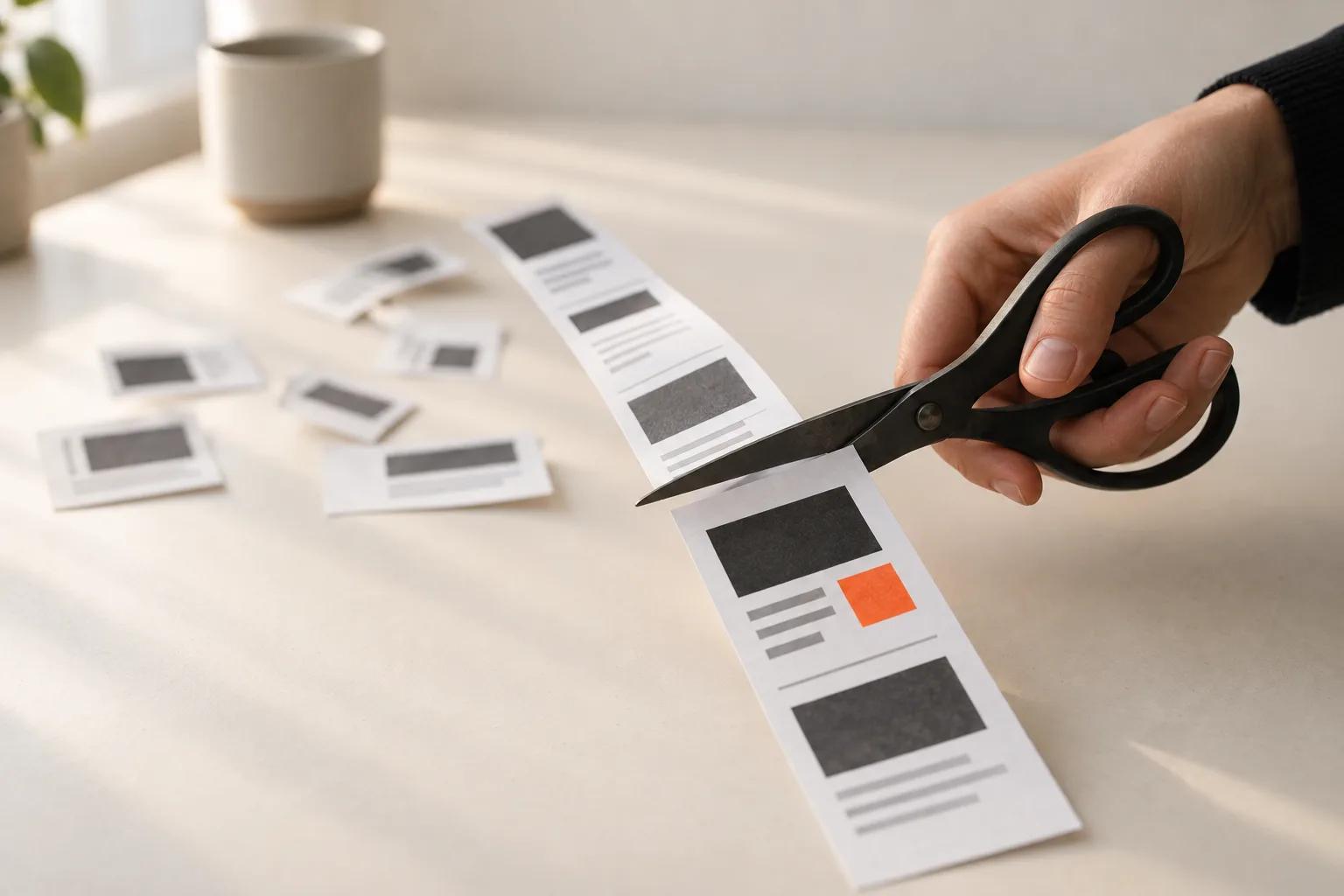
The navigation. Only a language toggle at the top. On mobile, a fixed bar slides in at the bottom with the button "Reserve your minagi".
The magazine and perspectives page. Valuable, but not on the landing page.
Mira and Kai. The chat disappears, and our virtual ambassadors stay off screen. The EU AI Act requires labeling for AI-generated people (Article 50). An AI label next to a form erodes trust exactly when it matters most. Mira and Kai do their job on Instagram and TikTok, where the label fits the format.
Three of the seven audience segments. The page shows four: focus, creation, study, and rest. Four sharp images build more recognition than seven half-resolved ones.
The rotating hero image. Three rotating images give way to a static one. More on that in a moment.
We're ditching the €1
Claude's smartest idea dies first. It proposed a €1 reservation. You get a fixed number, lock in the early-bird price of €99, and always get your euro back. Psychologically strong: someone who pays a euro has already said yes.
On September 17, Geert-Jan and I kill it. Now you reserve with just an email address, no purchase obligation. That eliminates a payment provider, a refund process, privacy policy updates, and a legal check on whether a €1 reservation counts as a sale.
The lesson: AI loves an elegant solution. The entrepreneur picks the route that fits the goal and audience.
Text that drives the engineering
Writing for a product in development has a neat side effect: the copy forces decisions. From the first draft, the description of the sound focuses on a single strike. "At the end of your session, minagi strikes a brass sound bowl once." When we review on September 7, I make that a brand decision. On September 19 comes the next step: that single, muted strike becomes a requirement for the technical design. The product designer and engineer choose the mechanism, hammer, and dampening based on that one sentence.
It works the other way too. The housing will likely be made from panels rather than a machined block. "Solid walnut" stays as long as the panels are solid. Phrases like "carved from a single piece" vanish. Below product images, we'll add: "Product images are renders of the final design. Prototype photos follow at launch."
Honest pricing and shipping
The price block tells the full story in two tiers. Numbers 1-200 at €99, numbers 201-500 at €129. Same object, different place in the queue. Below that, three promises: a reservation is non-binding, delivery comes six to nine months after the campaign, and the mechanism, striker, and sound bowl are replaceable and repairable.
We can hit six to nine months because minagi is entirely mechanical. PCB design, firmware, and electronics certifications disappear, saving roughly four months. Where an average hardware project runs twelve to eighteen months, we're faster.
Two faces
Claude's original draft kept the founders off the page. That follows our rule: minagi sells calm, and the story about an AI experiment might scare off a potential buyer.
On September 17, we sharpen that rule. Geert-Jan and I appear on the page, by name and photo, as minagi's makers. co-Founded by AI and the AI method stay out. Two people with faces give a Kickstarter credibility. The story behind those two faces lives here, on this site.
A hand that strikes
The new hero image: a hand turns the brass knob on a light oak desk, a phone face-down on the desk in the background. Sounds simple.
Nano Banana Pro renders the product cleanly, then three rounds of hands with stubby fingers or palms toward camera. GPT Image 2 at high quality draws a striking hand with legible dial numbers in one round. It costs 6.5 credits per image versus 2, and pays back the difference in time. New house rule: if there's a hand or person next to the product, use GPT Image 2. Product or setting alone, use Nano Banana Pro.
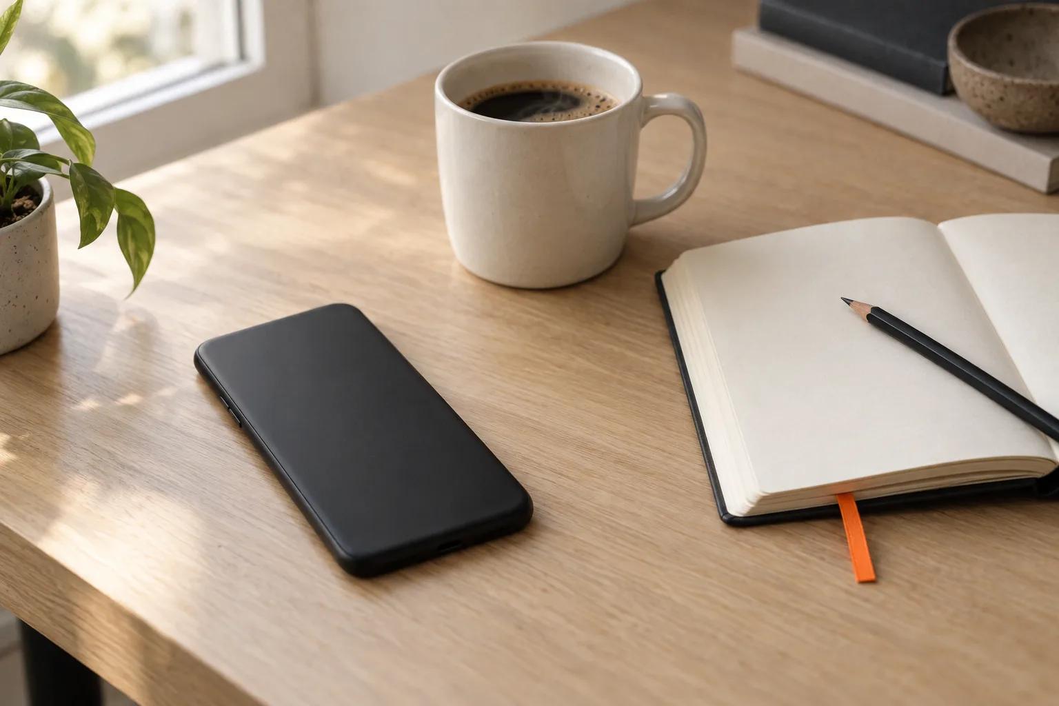
And that phone face-down? Stock photo models love showing a phone with a bright screen full of notifications. Ironic for a product about putting your phone away. The trick: ask for "only its plain back visible" and then check for camera lenses.
Findable as a timer
Bare "minagi" shares search results with an anime, a Mazda concept car, and a train station. There's also an app called Nagi. So the FAQ at the bottom answers the literal question "Is minagi the same as the Nagi app?". One sentence for the reader, a clear signal for Google and the language models that assemble answers.
What's next
The landing page sits alongside the current site. If reservations flow, we flip it: the landing page takes the front door and the rest moves to the back room. Three headline variants stand ready for A/B testing: "Take your attention back.", "A turn. An hour. A strike." and "The last timer you'll buy."
Three lessons for building your own launch page
- Start with the metric. Have AI suggest the numbers first, then the sections. Cutting then feels like math, not loss.
- Let AI be clever, you choose simple. The best mechanism is the one you ship this month.
- Write copy early. A sharp sentence about your product exposes decisions that would otherwise land on the engineer's desk too late.
View the current version of the minagi Kickstarter landing page at: (https://claude.ai/artifact/3X2BVWAhUFRBkt8WkGEkZo)
To be continued!
Sources
- EU AI Act, Article 50 (transparency requirement): https://artificialintelligenceact.eu/article/50/
- Week 6, Seven times the same cube: https://cofoundedbyai.com/blog/minagi-website
- Current minagi site: https://mi-nagi.com